Preliminary Task
Brief: To design and create the front cover and contents page for a school magazine aimed at pupils.

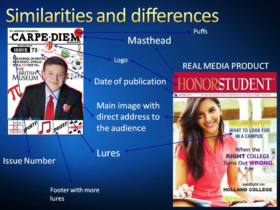
Magazine codes and conventions
There are certain features which are common to all magazines. Most magazines have:
- an advice column
- a contents page
- a letters page
- competitions
- an 'In the next issue' page.
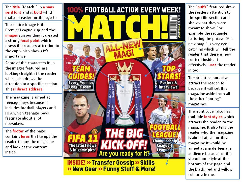
Magazine front covers also always have strong generic elements:
- price, bar code and issue number/date
- a photograph directly related to the feature article
- a recognisable masthead
- various lures and puffs on the front cover to entice the audience to buy the magazine
- a thematic link between the colours used and the month of publication as well as colour links between images and text, for example.
Magazine front covers are carefully designed to attract the target audience and be easily identified on the newsagent's shelves. It generally very easy to identify the genre of a magazine and the likely audience from a quick glance along the shelves.
For example:

From a quick glance, the audience can assume that this magazine is aimed at children due to the characters that are featured which are part of the famous Mario franchise which is also aimed at children. The audience can also tell that this magazine is a gaming magazine because the main feature of the front cover is a video game franchise.


The audience for the school magazine is school years 7 - 11. The age range of the audience that will be consuming the magazine is 11 to 16 years old. It is vital that the magazine contains aspects that interests all the ages of the targeted audience. The school is called "St. Michaels Academy" and the school magazine is called "Carpe Diem" which is Latin for "Seize the day". The colour scheme of the school magazine is red (#e23329) and black (#000000). Black mainly being the colour of text and red mainly for decorative purposes (such as puffs, banners and borders).
The school logo features a horse rampant which is the horse of Kent. On the right hand side of the shield are the religious symbols of a cross and a bishops hat. And also the right hand side of the shield is cut in to sectors which makes a cross too. These religious symbols reflect the strong christian ethos of the school along with the traditional Saint name of the school.


Front cover//contents page designs and analysis of real media products


Drafting Work
Below are drafts for my front cover and contents page designs.
Final Front cover draft:

Final front cover draft:

Below are the drafts that led up to the final drafts above. The two drafts below received positive feedback and so I combined the main image of the first one with the title style of the second one to create the final draft at the top of this post.


Audience and institution
The audience for the school magazine is school years 7 - 11. The age range of the audience that will be consuming the magazine is 11 to 16 years old. It is vital that the magazine contains aspects that interests all the ages of the targeted audience. The school is called "St. Michaels Academy" and the school magazine is called "Carpe Diem" which is Latin for "Seize the day". The colour scheme of the school magazine is red (#e23329) and black (#000000). Black mainly being the colour of text and red mainly for decorative purposes (such as puffs, banners and borders).
 |
| #e23329 |
 |
| #000000 |
Photographs


Final Products


Product Evaluation
- In what ways does your media product use, develop or challenge forms and conventions of real media products?


- How does your media product represent particular social groups?
My media product tries to represent the school rather than particular social groups. This is because the school is like a community, and communities are made up of many different social groups. For the magazine to be a "school" magazine it has to be aimed at all of those social groups withing the school itself otherwise it would be an exclusive magazine. There is a very positive representation of the school given in my media product. This is due to the motivational Latin magazine title of "Carpe Diem" which means "Seize the day!", which gives the reader a sense that the school is very motivational towards the pupils.
As the age range of pupils at St. Michael's Academy is 11-16 which is mainly teenagers, there had to be some parts of the magazine that appealed to teenagers. There are lures on the front cover which are clearly trying to make the magazine appeal to teenagers such as the "Games, Sports, Music, Prizes and more!" bar at the bottom of the front cover. These are the typical things that appeal to teenagers.
A way that my media product represents the social groups of teenagers would be through the use of language, house style and images. The language used is familiar to teenagers (pupils) and adults (parents and teachers). There is a main image of a teenager surrounded by iconography of school subjects on the front cover which presents the pupils as being hard working, positive and smart. The content of the magazine would appeal to adults because they will want to keep updated with school life. The house style is slightly informal to appeal to the pupils of the school whilst keeping formal for adults by keeping the school colours as the colour scheme for the magazine.
- What kind of media institution might distribute your media product and why?
- Who would be the audience for your media product?
- What have you learnt about technologies from the process of constructing this product?
I was fairly familiar to the program Illustrator but I followed some useful tutorials that helped me create the images featured on my front cover. For example:


No comments:
Post a Comment